In your response posts, comment on at least two of your peers’ posts and provide feedback as to whether you agree or disagree with their example(s). Make sure to reference what you’ve been learning in your textbook in your responses.

This graph is easy to read at a glance. The colors separate the columns well, and they are the same width. The vertical data is measured evenly and there are not a lot of unnecessary numbers above the data totals. The problem with it is that once it is removed from the text, the during and after labels don’t tell us what we are measuring exactly. In the article it is explained in the caption, so I feel as though it is an example of a good graphical representation of data.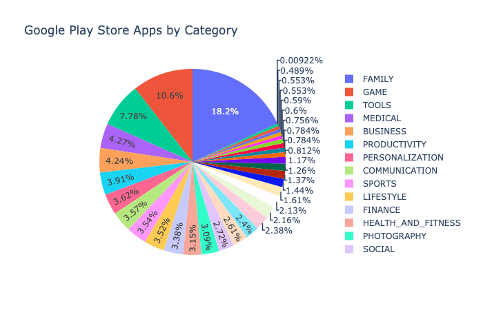
This pie chart is not easy to read. There are entirely too many categories listed. The labels have to be squeezed together for this reason, so the data is hard to decipher. This would have been better represented by a bar chart (Thales, 2020). For these reasons, I think that this is a bad graphical representation of data.
References:
Gao, T., & Gurd, B. (2019). Hospital size. Chart. BMC Health Services Research, 19(1), 6. https://doi-org.ezproxy.snhu.edu/10.1186/s12913-019-3907-6
Thales, B. (2020). Don’t use pie charts. DEV. https://www.dev.to/thalesbruno/don-t-ues-pie-charts-4177
less